Crossfit Millburn
The main objective of Crossfit Millburn is to assist its members in accomplishing their fitness objectives while fostering a warm and inclusive community. Diogo Dias, the head coach and proprietor, inherited the existing website and identified a low conversion rate for free trial enrollments. My aim was to revamp the website to enhance user experience and boost the number of sign-ups for free trials.
Design Goals
The primary objective of the redesign was to develop a responsive website that sparks interest in joining the gym by showcasing the health benefits of Crossfit. To achieve this goal, the redesign emphasized simplifying the process for users to register for a 7-day free trial and subsequently select one of the gym's membership plans. As the Lead UX/UI Designer for this project, my responsibilities encompassed a broad range of tasks, including research, ideation, responsive web design, logo design, and user testing. Additionally, I created a comprehensive design system for their website, ensuring a consistent user experience across all pages while providing clear guidance to the development team.

User interviews and Competitive Analysis
The aim of the research was to gain insight into the content that individuals anticipate finding on a Crossfit website. To achieve this, I examined Crossfit Millburn's main rivals and their indirect competitors, with the goal of obtaining a more comprehensive understanding of the present-day market. The collected data was then analyzed, categorizing each company's features into strengths, weaknesses, and similarities. In comparison to other prominent gyms, Crossfit Millburn's website lacked clear navigation and CTA's. I observed that the primary CTA on the top-rated Crossfit websites was geared towards encouraging potential clients to sign up for a free class/trial week, and that the design varied depending on the target market.

Redesigning the Design System
During interviews, participants expressed their reluctance to join Crossfit, citing feelings of intimidation. Even existing members at a Crossfit gym admitted to being hesitant to join due to their lack of familiarity with the exercises, a perceived lack of physical fitness, and pressure to socialize as part of the Crossfit experience. When redesigning our Design System, we had a specific color palette in mind. To create the system, I utilized components in auto layout and made full use of all of Figma's variant functions. This approach was chosen to ensure a seamless handoff to our developers, promoting consistency and efficiency throughout the design process.

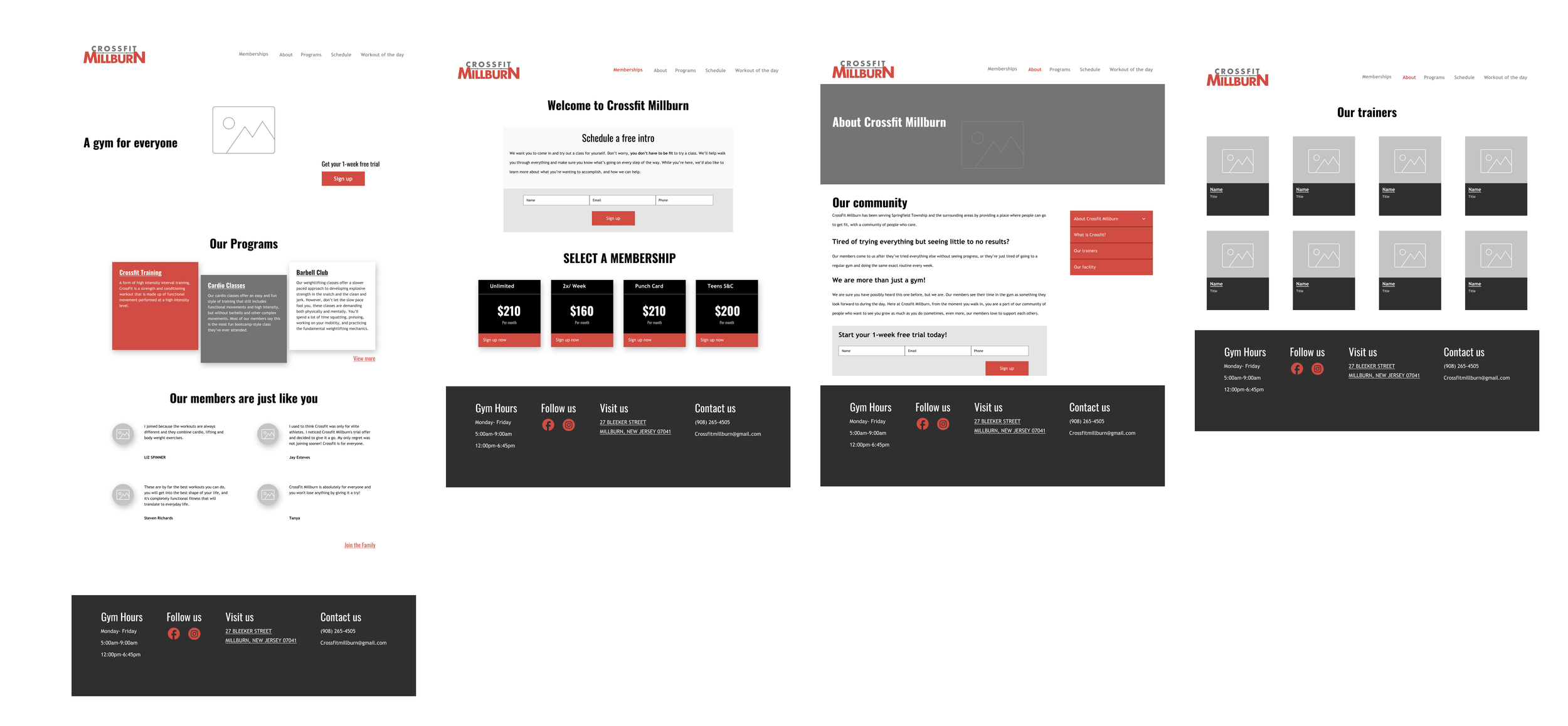
Lo-Fi Wireframes
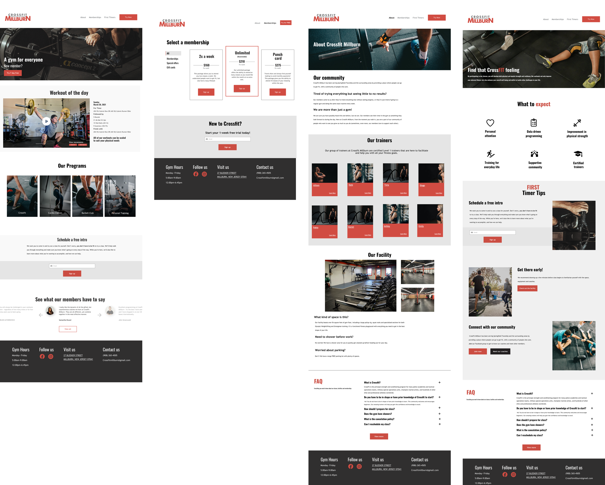
Hi-Fi Wireframes
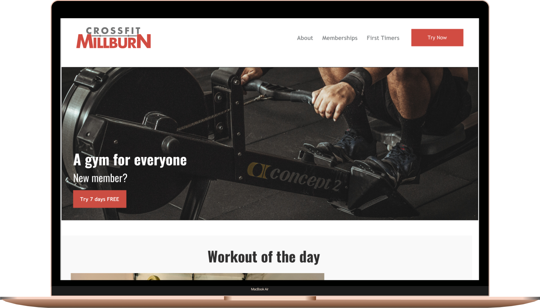
Prototype
During the user testing, participants were asked to perform specific tasks related to sign-up and membership, allowing the team to observe their interactions and gather qualitative and quantitative data on the usability of the redesigned pages. The findings from this evaluation were used to iterate and refine the design, ensuring a seamless and intuitive user experience for both new users signing up and existing members utilizing the website's features.
Takeaways
Redesigning this website presented challenges that I had not previously encountered. An essential lesson learned from this project was the importance of collaborating closely with the client to help them communicate their needs effectively. Furthermore, the insights uncovered during my initial research were instrumental in the revisions we implemented. Once the client approved the final pages, I transferred the file to their developer.