New York Times Cooking App
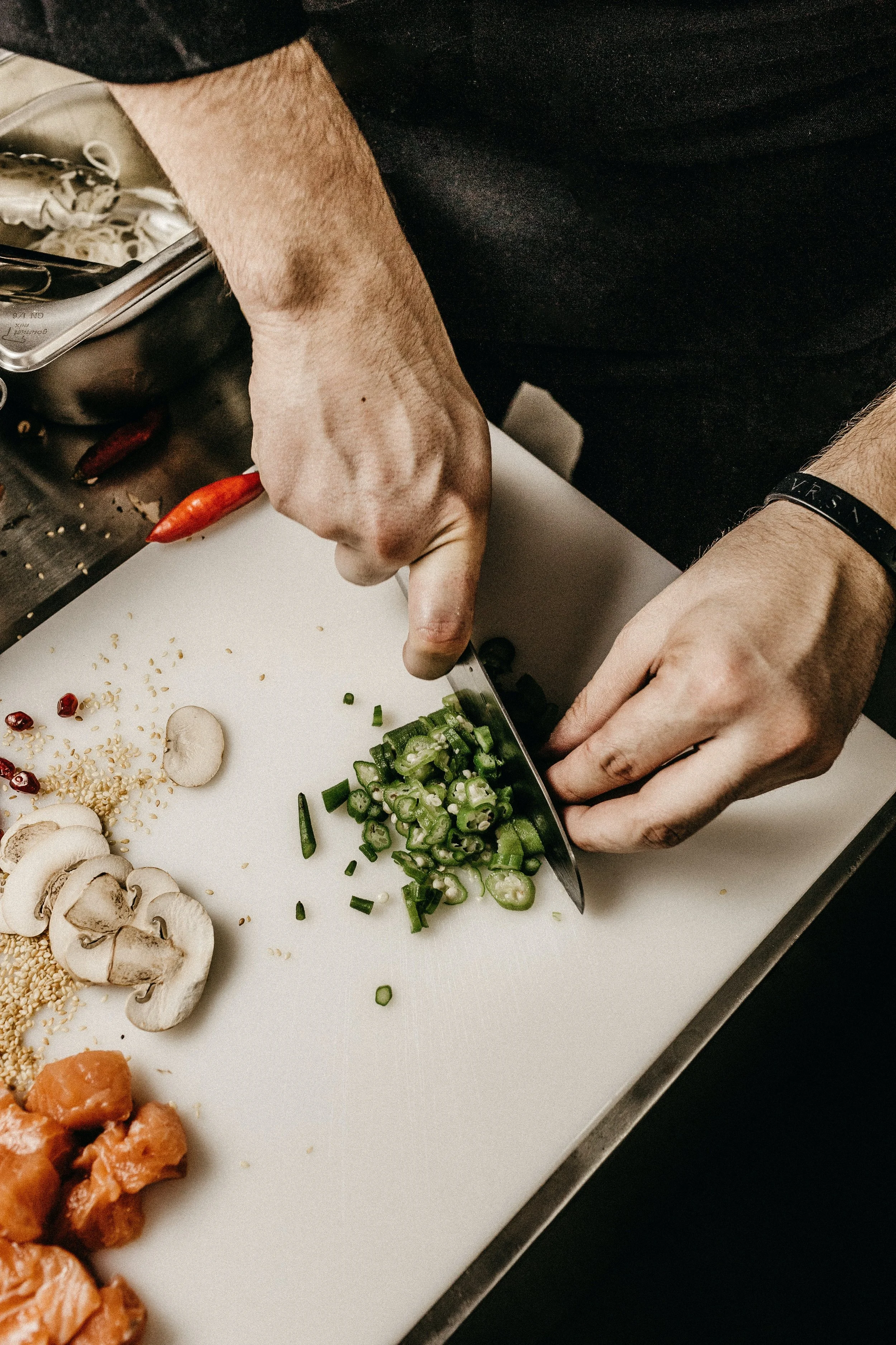
The New York Times Cooking app is a subscription-based app that enables users to view, save, and try recipes. Despite bookmarking and saving numerous recipes to cook later, I found it challenging to find time during the day to purchase specific ingredients. As a solution, I considered the idea of adding a feature to the app that would allow users to order groceries for the recipes, which would be particularly beneficial for individuals with busy schedules.

My Role
As the Lead UX/UI Designer, I conducted research to understand user pain points and competitive offerings. This informed the development of a primary feature, allowing users to place ingredient orders with brand choices and convenient grocery store pickup for a personalized shopping experience.
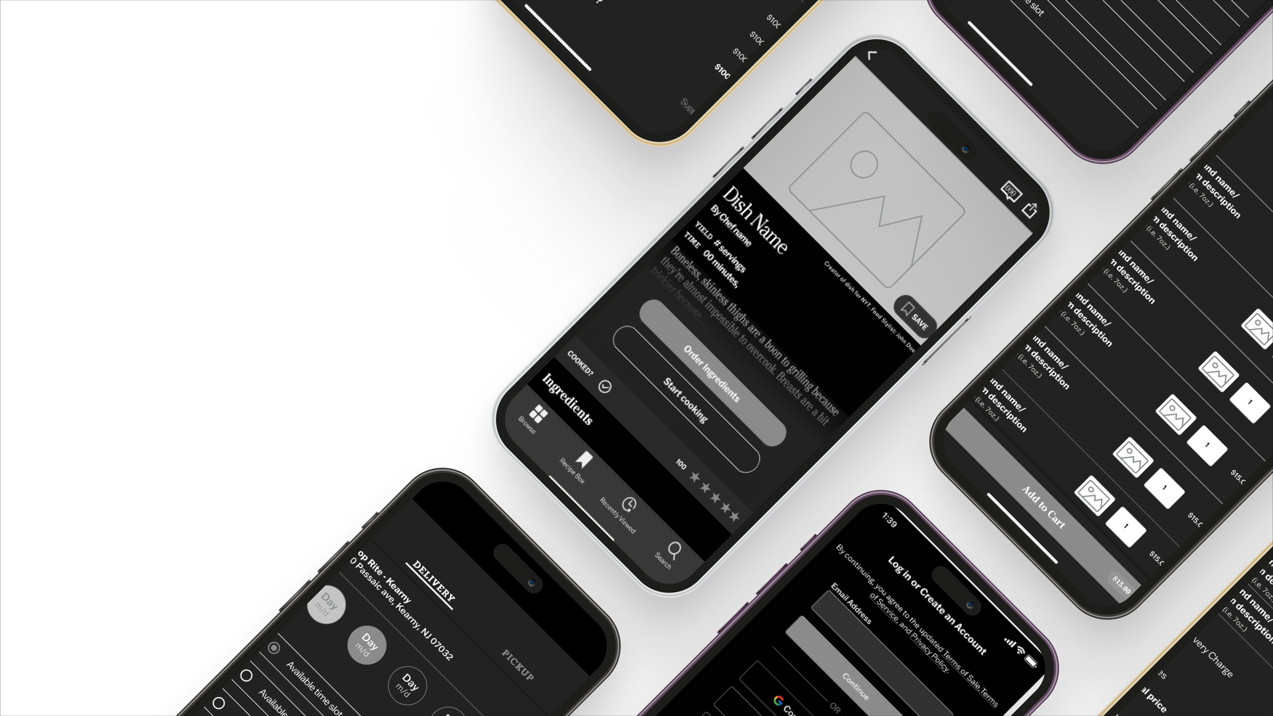
Creating Lo-Fi wireframes
During the creation of Lo-Fi wireframes, special attention was given to designing screens that accurately captured multiple states and user interactions, providing a realistic representation of the app's functionality. It was crucial to adhere to the established design patterns of the New York Times (NYT) to maintain consistency, enabling a smooth integration of the new features and ensuring that users experienced a cohesive and familiar design throughout the application. This approach aimed to enhance user satisfaction and minimize any potential friction caused by drastic design changes.
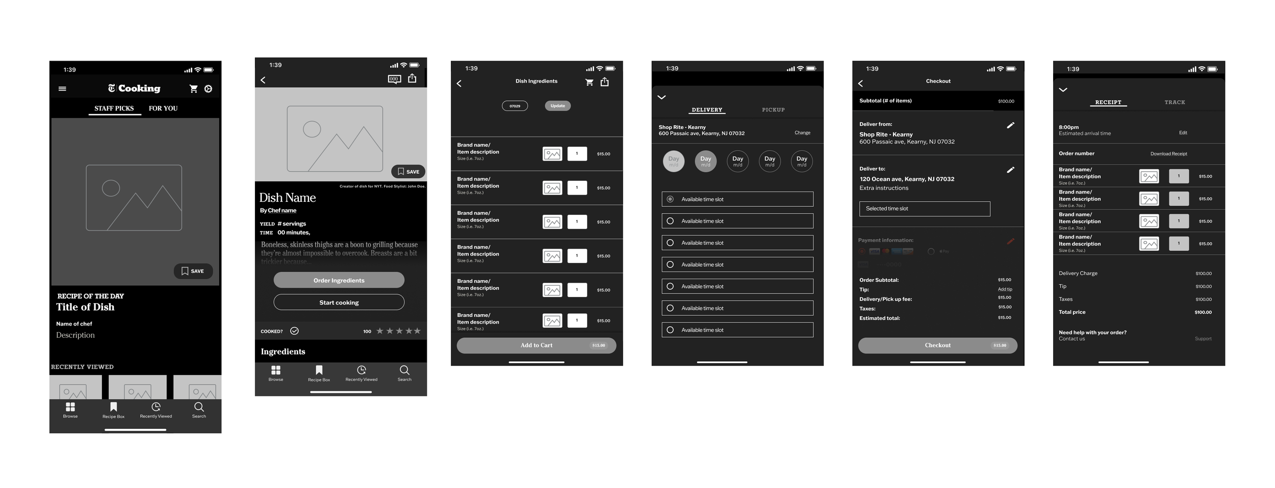
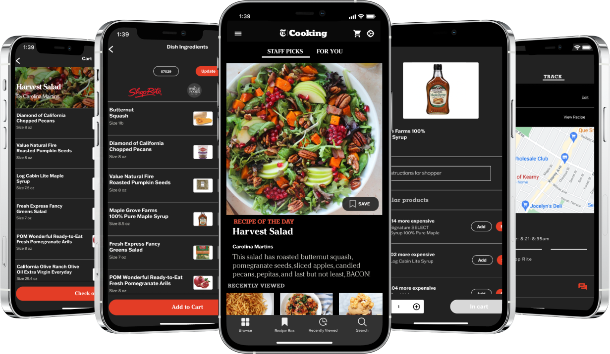
Designing Hi-Fi wireframes
The Lo-Fi screens and NYT's existing UI kit were used as a reference to design the new screens. The primary focus was on the ordering process and allowing users to swap ingredients in the cart, which were identified as users' requirements in the research. Designing these wireframes in Hi-Fi facilitated some iterations, including modifying the item line format and the "swap item" screen. However, some aspects did not translate as expected after seeing the screens in color.

Prototyping and testing the results
Taking inspiration from the Lo-Fi screens and leveraging the existing UI kit of NYT, I designed the new screens, prioritizing the task of ordering ingredients and incorporating the ability to swap items within the cart based on user research findings. Developing these wireframes in Hi-Fi allowed for iterative improvements, including adjustments to the item line format and the "swap item" screen. However, upon seeing the screens in color, some aspects didn't match my initial expectations and required further refinement.
Final Takeaways
Introducing a new feature into an established app presented an exciting opportunity to explore the possibilities of modifying the user interface while ensuring compliance with rigorous design guidelines. As a product designer, I am eager to delve into the technical intricacies that may arise during the feature's implementation and collaborate closely with developers to gain their insights and expertise, ultimately fostering a seamless integration of the new functionality within the app. This collaboration will contribute to the overall success of the feature and help deliver a cohesive user experience.